
Web Design is one of our strongest potentials at Opus Communication. Our design agency has been providing the most successful business websites following the cutting-edge trends in web-design. This article highlights these trends for the ongoing year. I hope it will be very informative for the designers.
Every year, Web design grows and so many awesome things are being published daily. In this blog, we’ll boil down some of the most prominent web design trends emerging in 2015. It is here that we can find true innovation and new opportunities – a few of which may completely change our understanding of a “modern website”.
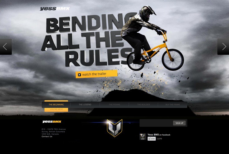
1. Websites give a cinematic and storytelling experience
“Make it big” seems to be the single most important principle of web design today. Yet for many people, it’s hardly acceptable that the homepage – specifically above the fold – consists of just a few words overlaid on an image or a video. Sometimes, even the navigation is removed or (at the very least) is hidden as a small icon.
The two flavors of this web design trend can be labeled as “Cinematic” and “Book Cover”. The first has been inspired by movies and TV ads, while the second enhances the classic concept of printed book and catalogue covers.
2. Creative navigations replace traditional navigations
One thing you might have noticed while looking at the examples of cinematic and storytelling sites is how some are straying from the traditional top navigation bar. User-experience is shifting from a clear hierarchical navigation to a rich user experience with the use of full-screen photographs, videos, interactive elements and animation.
Website navigations usually consist of links set in a menu bar with the viewer clicking through, and scrolling down each page. Now, we are seeing very sophisticated navigations — main menus are being reduced, sometimes disappearing completely or sliding behind screen edges.
3. Websites incorporate parallax effects
When there is really no story to tell, some websites choose to imitate camera movement with parallax effect. Parallax creates an illusion of depth by making elements (layers) of a web page move at different speeds as viewers scroll.
I’ll give an example to help visualize this: When you are driving, the trees surrounding the road seem to move by your car quicker than say, a house you’re coming up on in the distance. Simulating this visual effect on a monitor screen provides for an engaging user experience. This effect has been known for some time, but is being used more and more in web designs.
4. Typographic Styles
Swiss design style, or the International Typographic Style, has been inspiring designers since the 1950s. Swiss design style features typography as the primary design element, and favors sans-serif typefaces, grids and asymmetrical layouts. Fathers of this style focused on simplicity, legibility and objectivity.
Recently, this style has shined in a new light with Windows 8 interface release. This idea of using grids and grid-based typography is gaining even more attention.
5. Scrolling Trends
It hasn’t gone unnoticed that most new site designs published today tend to be longer in length when scrolling through the page. As mobile devices become more popular, it’s becoming more commonplace for sites to opt for scrolling instead of linking as a means to display content, especially on their home pages.
6. Fix width centered site layout
Most websites over the last few years have used the “banding” or width: 100 percent design element so that things like images and sections visually stretch the complete width of a browser’s viewport. Before this trend became popular, most sites were fix-width and centered in the page. You could tell where the site ended on either side.
7. Hidden Main Menus
Much like flyout/slideout menus, I anticipate seeing more sites hiding their main menus all together when visitors first visit the site. These hidden menus will only become visible when the visitor is ready to move on and clicks the appropriate icon.